A basic typographical solution – composed of two separate fonts surrounded by simple graphic forms – allows each word to remain independent and distinct. The tagline offers a glimpse into the nonprofit's humble approach to helping people build more stable lives with low-barrier jobs.
In addition to a formal wordmark, other letterform marks were designed to provide flexibility for various secondary applications, such as business cards, vehicles, T-shirts, and graphic patterns.
helveticka worked with the Spokane Public Facilities District and Spokane Public Schools to create the logo for ONE SPOKANE STADIUM, a 5,000-seat outdoor venue for sports and entertainment events in downtown Spokane.
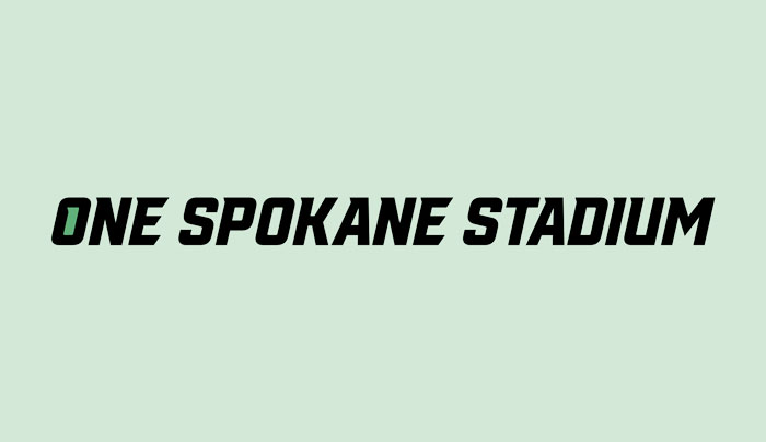
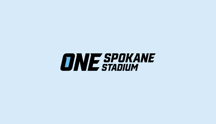
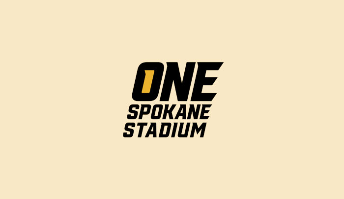
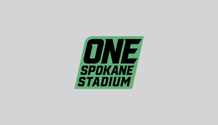
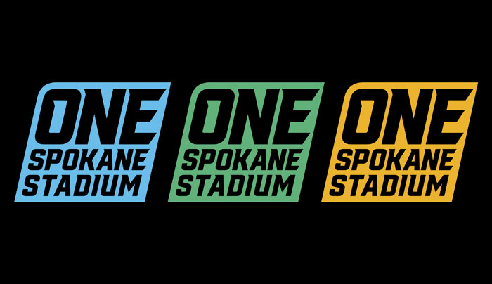
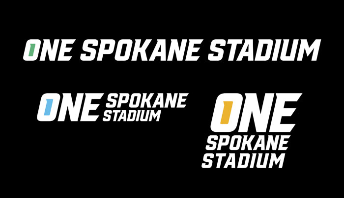
A formal wordmark, along with other logo compositions and color schemes, were developed to support and help promote the stadium's high school activities, United Soccer League teams, and other non-athletic performance events.
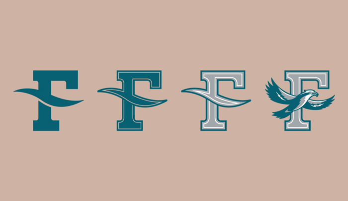
Spokane Public Schools commissioned helveticka to design and develop a logo system for the new Sacajawea Middle School.
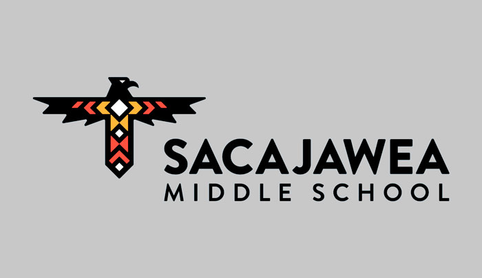
The school retained its original namesake and thunderbird mascot, which were first established in 1960. We created formal and informal wordmarks with the assistance of school district representatives, along with a direct descendent of Sacajawea.
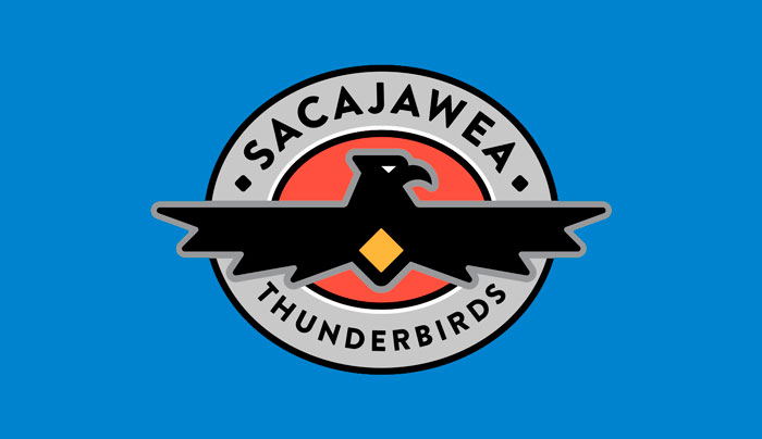
Characterizing strength, resilience, and protection in Native American mythology, the thunderbird symbol was modified for use in secondary logo applications.
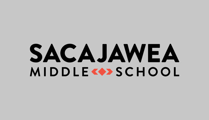
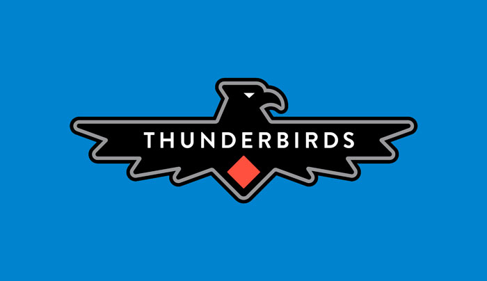
Utilizing the formal logo typeface, we developed customized letterforms as shorthand for the school's name. These provide additional flexibility in various applications.
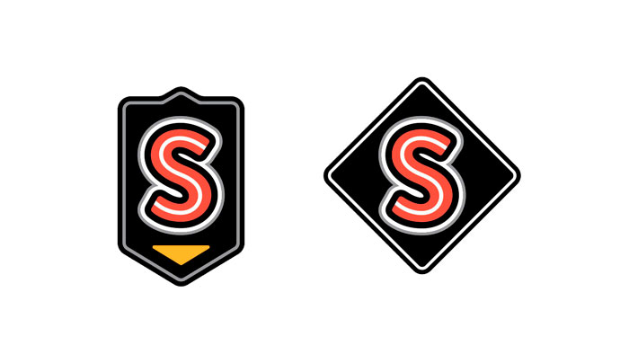
Simple "S" badges can be applied to miscellaneous school apparel, including athletic uniforms, jerseys, and caps.
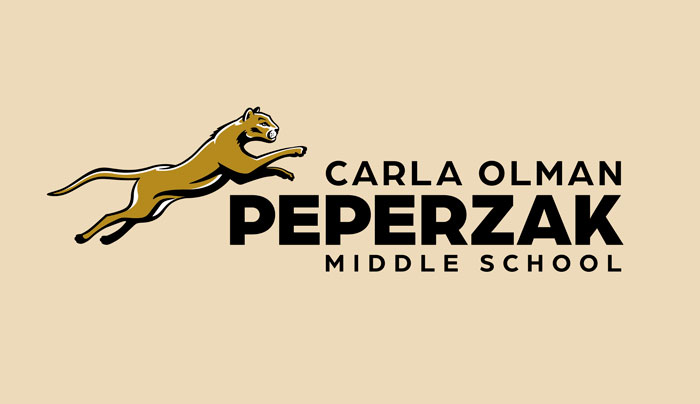
Helveticka worked alongside the Spokane Public Schools to create a logo system for the new Peperzak Middle School.
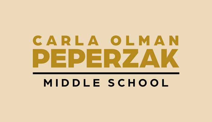
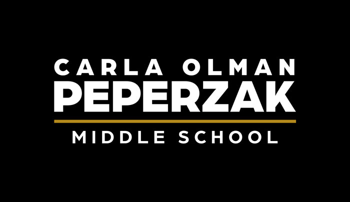
The formal wordmark, shown in positive and negative application, is ideal for official communications. The logotype honors the school’s namesake, Carla Olman Peperzak, who joined the Dutch Resistance during World War II to help save Jews from the Holocaust.
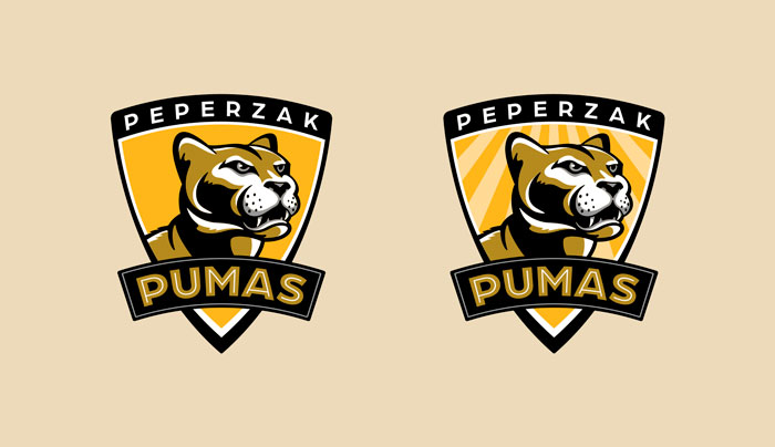


Combined with customized letterforms, multiple pictorial marks of the school’s puma mascot can be applied in a variety of sizes and purposes, such as stickers, tumblers, t-shirts, and wall graphics.
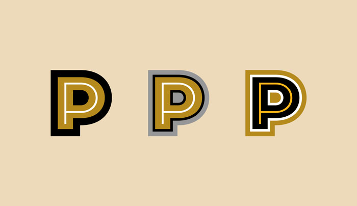
The letter P stands alone in three separate letterform marks to identify the school on athletic uniforms, caps, and jerseys.
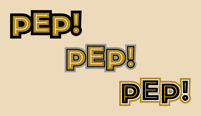
Inspired by the Peperzak name, a series of PEP! graphics encourage school spirit.
Helveticka teamed up with the Spokane Public Schools to create a comprehensive logo system for the Denny Yasuhara Middle School.
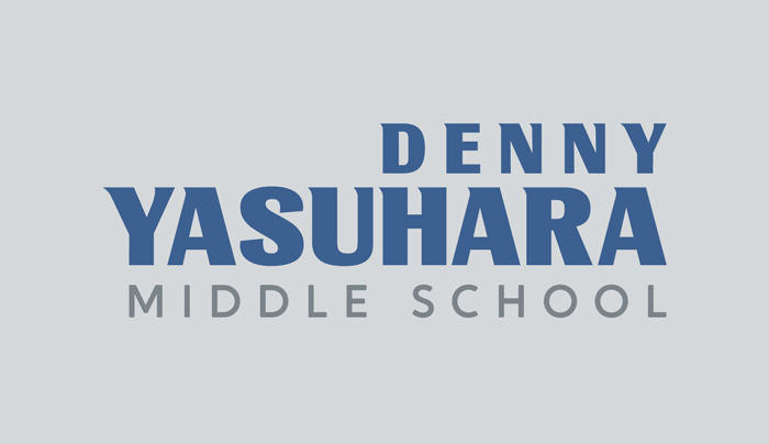
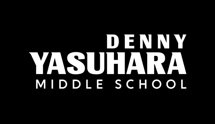
This logotype honors the school’s namesake, Denny Yasuhara, a Spokane Public School teacher and an advocate for Japanese American civil rights. The formal wordmark was designed for the school’s official communications.


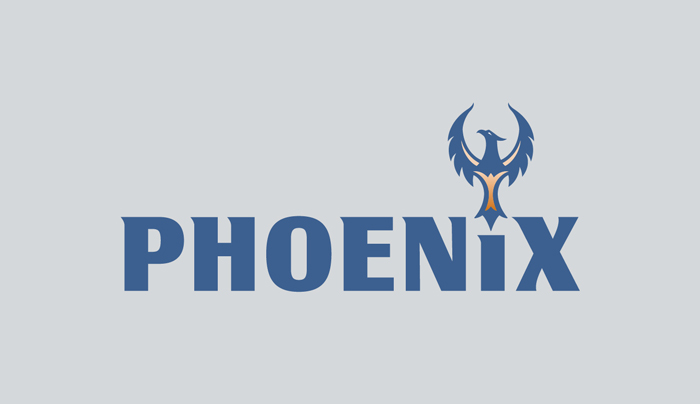

Multiple pictorial marks of the school’s phoenix mascot – in conjunction with customized letterforms – give the school flexibility to apply the logo to everything from t-shirts and tumblers to stickers and wall graphics.

The letter Y stands alone in a series of letterform marks to distinguish the school’s identity on athletic uniforms, jerseys, and caps.

Denny Yasuhara was affectionately known by his students as “Mr. Yas.” A series of YAS! graphics inspired by this nickname promote school pride in the student body.
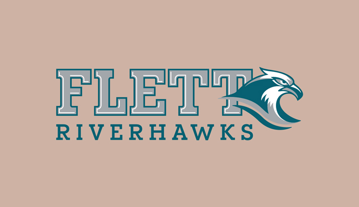
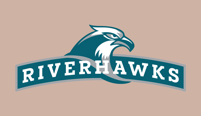
In collaboration with the Spokane Public Schools, helveticka designed multiple logos for the Pauline Flett Middle School.
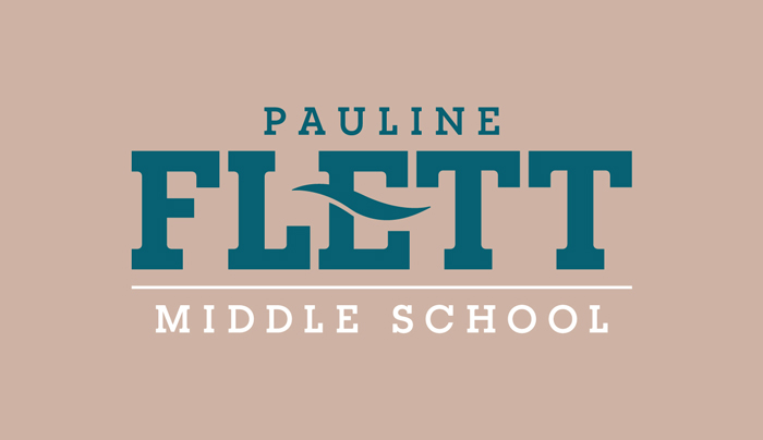
This formal wordmark is ideal for official school communications. The logotype honors the school’s namesake, Pauline Flett, who was an elder of the Spokane Tribe of Indians and a champion of preserving the Salish language.
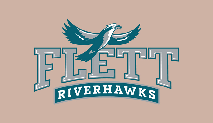
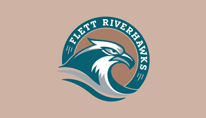
Multiple symbols of the school’s riverhawk mascot inspire school spirit and offer flexibility for a variety of applications, from t-shirts and tumblers to stickers and wall graphics.
Simplified letterform marks identify the school on athletic uniforms, jerseys, and caps.
Tasked with naming a facility that embodies the highest levels of athletic achievement, helveticka created The Podium; its logo employs a perfect O situated on a plinth to represent a medal and a podium, respectively.
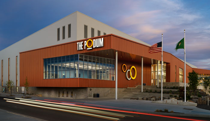
Exterior building signage near The Podium’s main entrance extends the facility’s theme and takes advantage of sight lines from nearby streets and sidewalks.
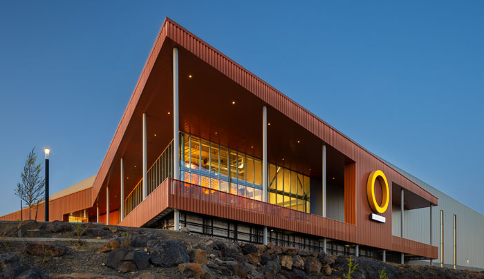
Located on the south end of the building and overlooking Spokane’s Riverfront Park, the 16' symbol, derived from the logo, is a beacon easily seen from the city’s downtown.
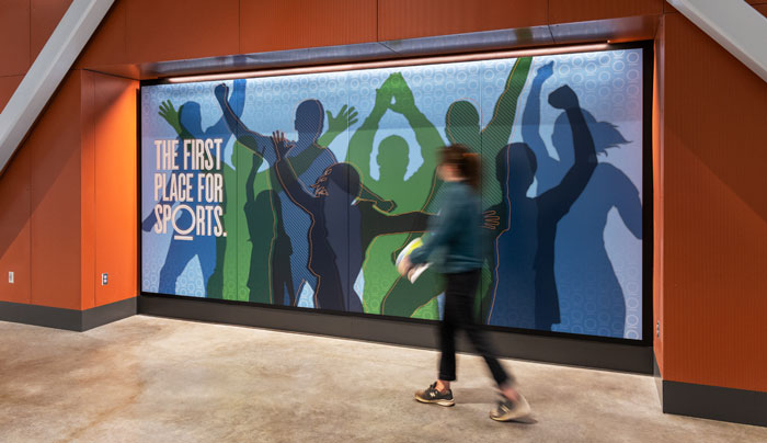
The Podium’s tagline is featured on a fan wall that employs magnets to hold dynamic event information.
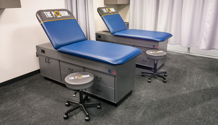
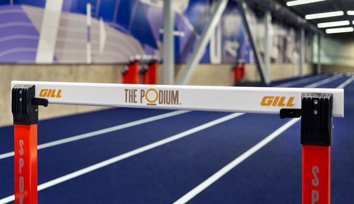
The Podium’s identity is carried throughout the facility, including its athletic training room.
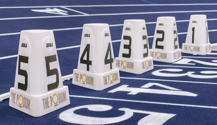
The five lanes indicating the start of the 60-meter dash.
The warm-up track, in the lower level of The Podium, for competitors.
Customized letterforms are placed within square shapes to provide a sense of rhythm; the interior lines offer structure, while the transition from light to dark blue tones suggests movement.
The Steam Plant’s refreshed logo not only captures the building’s iconic stacks, but also employs industrial typefaces and colors that hark back to its 1916 origins. Multiple descriptors are used, depending on the application: “Est. 1916” (for the entire campus), “Kitchen + Brewery,” “Specialty Shops,” “Event Space,” and “Brewing Co.,” while the bold outline shape of the logo itself allows for placement within any background or texture.
helveticka worked alongside stakeholders from all six of Urbanova’s founding partners to develop a new name and tagline for the entity – as well as design its logo.
Gonzaga’s logo features the spires of St. Aloysius Church, an iconic 1911 structure adjacent to the university’s campus.
After more than three decades designing logos – one of the most important visual elements of a company’s brand – there’s no way we could show them all. So here’s a look at just a few we’ve done, each of which expresses the unique personality characteristics of the company it was created for. Animation by Digital Itch.